2014’s web design slogan might as well be “Flat is Where It’s At.”
All over the web, you’ll find dozens of tutorials, elements and examples showing you how to create your own flat-style web design.
But what exactly is a flat design—and why should you care?
As it turns out, flat web design is just as much about trend-setting as it is about improving the user experience. Let’s talk about why and how, and then I’ll share 11 resources to help you create your own flat style, responsive site.
Why Flat Design?
Flat design has been around for a while, but it really took off when Windows 8 and its “Metro” interface hit the stage, shifting design trends from bulky textures and gradients to vibrant colors, simple shapes and “flat” elements—hence the name.
There’s also a considerable shift toward more white space and large typography, making it easy to browse the layout on a variety of devices.

An example of a flat web design
Flat design is also the antithesis to skeumorphism, a design term that simply means a digital graphic that has its inspiration from a real-life object.
Apple’s previous designs focused heavily on the skeumorphism angle—you can see the hands on the analog clock or click buttons on the digital calculator. Except that when you’re sitting at a computer, the analog clock on your screen is difficult to read, and the calculator buttons are a pain to click individually when you could simply type them in instead.
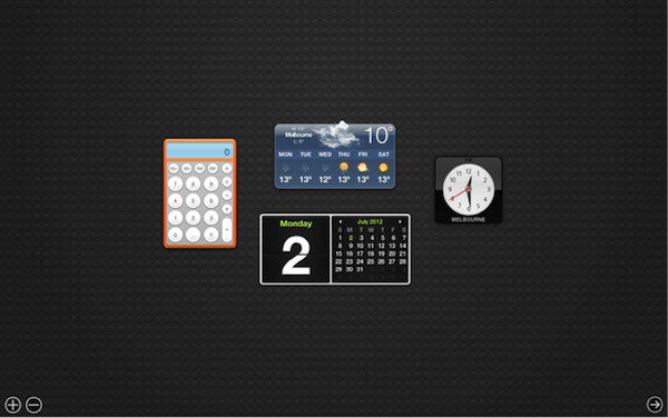
Apple’s analog clock and calculator are cumbersome to use in a keyboard/mouse environment
Here’s another example. Notice the realistic icons converted to simple shapes:
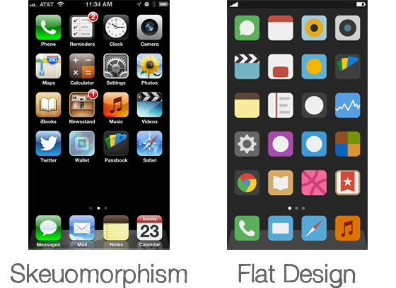
Skeumorphism vs. Flat Design – Source: Basic Principles of Flat Design
In these cases, large, flat, easily tappable buttons and digital interfaces would be much more inviting. And this idea has finally extended to the web as well.
What Does it Mean for Website Users?
Websites are naturally suited to blocks of content, a type of layout where flat design is totally comfortable.
And, while I don’t recommend ditching your current design just to embrace a trend where it doesn’t make sense, there is a marked difference in the conversion rates of simpler, clearly illustrated sites versus their cluttered counterparts.
Plus, flat designs are endlessly adaptable and are perfectly at home in mobile environments as well as on tablets and regular computers, making them great for responsive designs.
How Do I Create One?
Glad you asked! There are tons of design resources out there to help anyone who wants to create a flat website design, but listed below are some of my personal favorites spanning a variety of categories.
Website Layouts
Wireframe (GIF and PSD)

This wireframe design (also available as a PSD) will help you lay out your new flat website according to best design practices.
Flat GUI Set

This collection contains 7 PSDs, a vector PSD, 500+ individual elements, as well as vector icons. 30 different colors available. Everything from music playlists to contact details and error messages are included here in a flat style. Free and commercial versions available.
Responsive Frameworks
Furatto
 Furatto is an open-source responsive framework made with flat design elements
Furatto includes elements for landing pages, carousel slideshows, basic templates and a dashboard, among many other things. Its flexibility and ease of use let you create stylish layouts on the fly.
Responsive Web CSS

Design responsive layouts in minutes with Responsive Web CSS
Responsive Web CSS is a quick way to prototype how your design will look in a variety of devices. This method saves hours of time and helps you get the layout just right without the hassle or guesstimation.
Bootstrap

Twitter’s Bootstrap framework is one of the most popular choices for quickly building responsive designs.
沒有留言:
張貼留言